From Brave Magazine: http://www.bravemagazine.com/blog/designing-a-good-flag/
Having been in the flag business for over 40 years, I’ve seen both good and bad designs for custom flags. Many people overthink the process and clutter their flag with too much symbolism. You need to pare down your ideas and focus on what’s the most important thing you want to convey. Are you trying to tell who you are? Where you’re from? What you do?
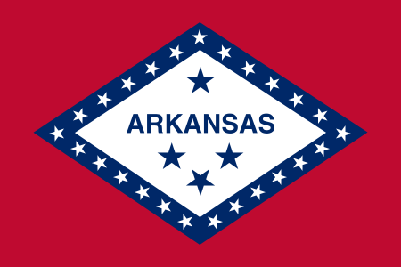 Many state flags want to represent their history. The Arkansas flag (which I think is a good design) expresses something unique about our state. We have diamonds. Next to the Christian cross, the U.S. flag is one of the most recognized symbols of all time.
Very few products can boast they’ve been in use since the beginning of civilization. Flags date back to before anyone can even remember. People have flown fabric symbols to convey messages, represent their family, group, cause, devotion or for decoration. Today, branding is an important use of flags.
The thought process for how to design flags is similar to a child with a blank sheet of white paper and only three crayons. Try not to exceed those three colors, and keep the colors solid. Gradation (or shading) may look nice on a website or print material, but it does not look as good on a flag.
You should never put a seal or map on a flag. Small details cannot be recognized from afar. You want the design to be recognizable from atop a flagpole. What’s more, such details may be expensive to reproduce, and you want your flag to be affordable for all supporters.If you decide to put words on your flag, keep in mind one side will read correctly and the other side will have a reverse image, like the Arkansas flag. In the flag industry, this is called “single reverse.” If the word or wording is well known, you will subliminally read the backside without even realizing that it’s backwards, as is the case of the Arkansas or Coca-Cola flag. Your company name may not be as recognizable, therefore your logo might be better to use for flag purposes.
Remember, a flag is not a sign; it’s a symbol. If you want to have your flag read correctly from both sides, it has to be a “double sided” flag, meaning two flags are sewn back to back. This method makes your flag too heavy to fly under normal wind conditions, and of course it costs twice as much.
I do not recommend this construction. Most of the time you want your flag to flap and dance about, creating attention and interest. You also want to be able to afford a fresh flag annually, if not before.
A friendly flag that waves every day is a happy flag.
So, get out your paper and crayons and start designing!
