How to design flags effectively

I can’t remember the last time I saw so many flags in the news. It began peacefully at first, with the Sochi Olympics, but as soon as that was over, a burst of chaos and protests broke out, and the whole world began waving their flags. Learning how to design flags isn’t as easy as it seems.
Flags date back to before anyone can remember. For millennia, people have flown fabric symbols to represent their cause, patriotism, revolutions and even sports teams. People also use flags to gain recognition, for advertising purposes and sometimes just for the beauty of the flag itself. The list of uses for flags and banners is endless.
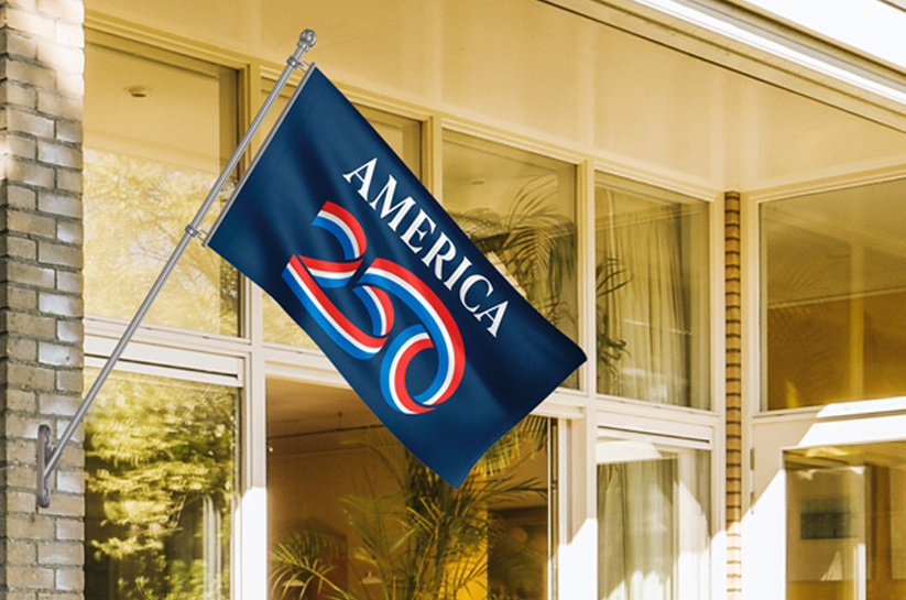
When learning how to design flags, simplicity is key. Next to the Christian cross, the U.S. flag is the most recognized symbol of all time. This is due, in part, to its simplistic design. Simplicity is one of many qualities that make a flag more effective. The old design adage, “less is more,” is definitely true of flags.
The thought process for how to design flags is similar to a child with sheet of white copy paper and only three crayons. Do not exceed those three colors, and keep the colors solid. Gradation may look nice on a website, but the shading may not look as good on a flag.
You should never, ever put a seal or map on a flag. Small details like that cannot be recognized from afar, and you want the design to be recognizable from atop a flagpole. What’s more, such details may be expensive to reproduce, and you want your flag to be affordable for all supporters.
If you are interested in learning more about flag design, FlagandBanner.com has a glossary of common flag terms on its website.
Kerry McCoy is founder and president of FlagandBanner.com and owner of historic Taborian Hall where the famous Dreamland Ballroom resides. She is also publisher of Brave Magazine. If you would like to interview Kerry or have her speak at your event contact tammie@flagandbanner.com.


