I’m a big proponent of change and believe that if your business or personal life are not evolving, then you are being left behind. But change can be difficult, emotional, and controversial. And so goes the changing of a long-standing state or country flag.
In the News
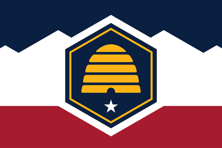
The most recent flag design change is happening in the state of Utah. The new flag is set to take effect in March 2024, and features a large beehive (they are the beehive state). The overall design is simple, with bold shapes and lots of symbolism; Utah’s iconic mountains, a hexagon for strength, a star for their 1896 statehood, the beehive, and our country’s R-W-B color scheme.
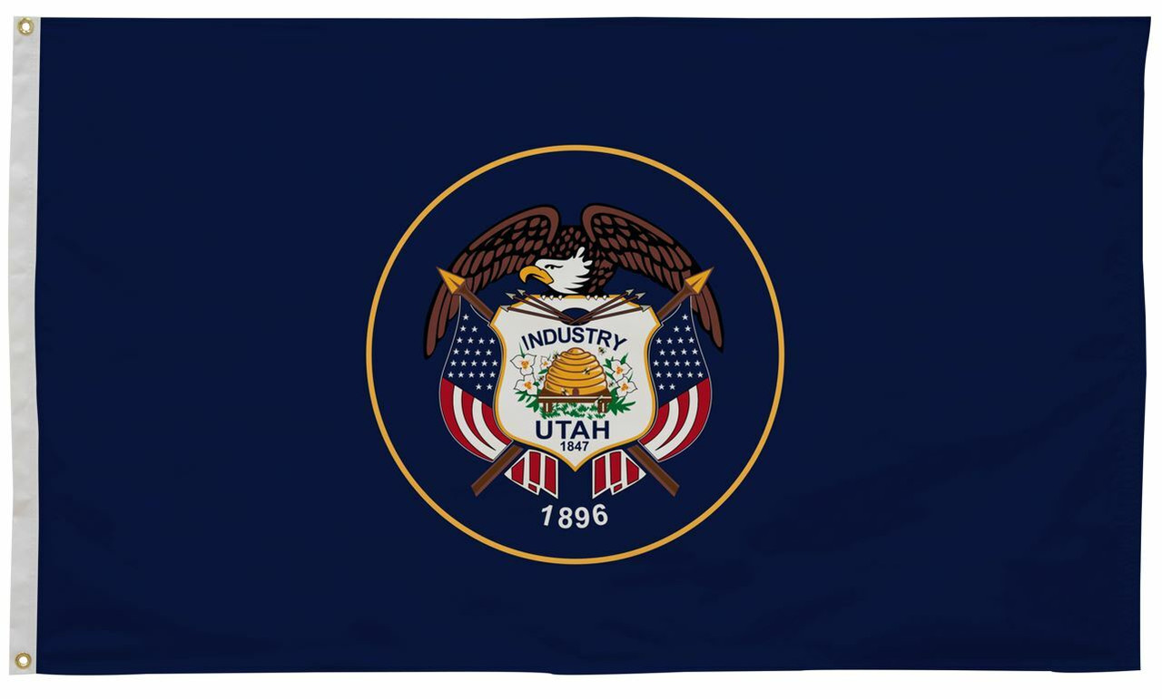
To ease everyone into the changing of their state’s colors, Utah’s Governor is allowing for both flags to be flown at the same time. When I first read his idea, I thought it was silly but, after further thought, it sounds like a nice compromise. For the Utahns who struggle with change, he gave precedence to the out-going flag by calling it the “historical flag” and established that this flag, when flown with the new, would be flown atop or to the right of the new one.
Good Flag vs Bad Flag
Having been in the flag business for over 40 years, I’ve seen both good and bad flag designs. Like most good designs, less is more; and so it goes with flags. Many people overthink the process and clutter their flag with too much detail and words that can’t be read from afar.
When starting the process of designing a new flag, it’s best to think like a child with a blank sheet of white paper and only three crayons. Try to keep your color choices to a minimum and keep the colors solid. Gradation (or shading) may look nice on a website or print material, but it does not always look good on a flag.
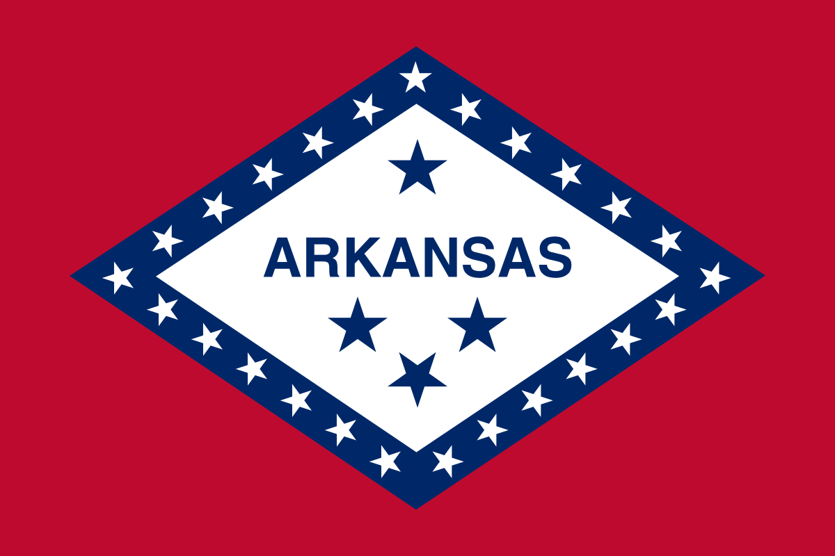
Stay away from a seal or map on a flag. Utah’s soon-to-be historical flag had too much small detail that cannot be read from afar. You want the design to be recognizable from atop a flagpole. What’s more, such details may be expensive to reproduce, and you want your flag to be affordable for all flag fliers. If you decide to put words on your flag, keep in mind one side will read correctly and the other side will have a reverse image, like the Arkansas flag. In the flag industry, this is called “single reverse.” If the word or wording is well known, you will subliminally read the backside without even realizing that it’s backwards, as is the case with Arkansas’, McDonalds’, or Coca-Cola’s flag.
Focusing on what’s important or unique about your state and its history is a nice starting point for a new design. The Arkansas flag (which I think is a good design) expresses something unique about our state: we have diamonds.
Flags Have a Long History
Very few products can boast that they’ve been in use since the beginning of civilization. Flags date back to before anyone can even remember. People have flown fabric symbols to convey messages, represent their family, community, cause, devotion or just for decoration. Today, branding is an important use of flags. Remember, a flag is not a hard sign; it’s a friendly, waving symbol. I am happy for Utah. I know the change was hard but I like their new flag much better. In 2024, if I see the flag on a pole or waved at a political or sporting event, I will know instantly who they are: the beehive state. Not sure I could say that about their historical flag.
Get Kerry’s latest blog post every week by entering your information under Join Our Mail List in the side bar and clicking Subscribe

